How to Mix Colors When Painting
Master practical color-mixing for painting with a step-by-step approach: color theory, primaries, neutrals, tints, tones, and palette testing under varied lighting to ensure consistent, harmonious results across works.

By the end of this guide you will be able to mix colors confidently for painting, from choosing pigments to achieving balanced neutrals and harmonious palettes. You’ll learn how to read a color wheel, mix tints, shades, and tones, and test swatches under different lighting. According to Mixer Accessories, practical color-mixing starts with a simple plan, clean pigments, and consistent mixing cadence to keep results predictable.
What color mixing is and why it matters
Color mixing is the core skill behind how to mix colors when painting. It’s the practice of combining pigments to create new hues, adjust value, and set mood. When you mix colors deliberately, you can control the emotion, atmosphere, and realism of your work. A strong color strategy helps you predict outcomes, maintain consistency across sessions, and avoid muddy or dull results. For home painters, hobbyists, and students, the goal is to make color choices feel intentional rather than accidental. According to Mixer Accessories, practical color-mixing starts with a simple, repeatable plan, clean pigments, and a calm mixing cadence that keeps results predictable across lighting conditions. Doing color work this way reduces guesswork and builds confidence as you move from rough sketches to finished pieces.
Building blocks: color theory basics
Color theory offers a roadmap for mixing with intention. At the core is the color wheel: primaries (red, blue, yellow), secondaries (orange, green, violet), and tertiaries that emerge from mixing adjacent hues. Warm colors (reds, oranges, yellows) tend to advance visually, while cool colors (blues, greens, violets) recede. Values describe lightness or darkness, while saturation describes intensity. A robust palette balances these elements: you’ll often use a limited set of primaries plus neutral whites and blacks to create a wide range of mixtures. Understanding complementary (opposite on the wheel) and analogous (neighbors) schemes helps you predict how colors will interact in a painting. Practically, this means you can plan color harmony before loading your brush.
Setting up your palette and swatches
A well-organized palette is the backbone of reliable color mixing. Start with a small, core set: three primaries (one warm, one cool, and a yellow), white, and black. Add a few convenient earth tones or a couple of favorites for convenience. Arrange pigments in a logical order (warm to cool, or by color family) and place swatches nearby. Label each swatch with the paint names and ratios you used so you can reproduce mixes later. A clean workspace reduces contamination, which is essential for maintaining color accuracy across sessions. Mixer Accessories notes that clean water, brushes, and wiping towels are as important as the pigments themselves.
Techniques for mixing: tints, tones, shades, and neutrals
Mastering tint (color + white), shade (color + black), and tone (color + gray) opens up a spectrum of options without overloading the palette. Neutrals are invaluable for balancing bold hues and creating depth. Start by selecting a base color, then gradually add white to create tints, or black to deepen tones. When making neutrals, mix complementary colors in small increments to avoid muddy results. Always test your mixtures on a scrap sheet or canvas edge before applying to your painting. Documenting the exact ratios helps you reproduce results consistently.
A practical workflow: primaries to full palettes
A repeatable workflow saves time and improves predictability. Begin with a deliberate core palette of primaries, plus white and black. Build tones by adding small increments of gray or complementary colors. Create a few go-to neutrals that pair well with your subject matter. As you practice, develop a habit of swatch testing under the lighting conditions you paint in most often. This practice reduces surprises when you move from study to final piece and helps you maintain color relationships across the entire painting process.
Testing, documenting, and adjusting color in lighting
Lighting dramatically affects color perception. Always test your mixes under the light you’ll use for the final piece—natural daylight, a simulated daylight lamp, or your studio lighting. Take notes on each swatch: hue, value, saturation, and how it looks next to adjacent colors. If a mix reads too warm or too cool, adjust with a tiny amount of its complementary color or a slight shift toward white or gray. Over time, maintaining a color log—names, ratios, and observations—reduces guesswork and improves consistency across different paintings or sessions.
Common mistakes and how to fix them
A frequent pitfall is muddy color caused by over-mixing or using dirty brushes. Clean tools between color families and rinse your brush before major color shifts. Another mistake is over-reliance on pure primaries; mixing them with a touch of white or gray often yields more harmonious neutrals and variations. Avoid excessive thinning with water or medium, which can dull color intensity. Finally, don’t skip testing; always compare swatches to the on-canvas result in the actual lighting where you work.
Finishing touches: keeping color consistent across paintings
Consistency comes from documentation and disciplined practice. Keep a color journal: record pigment names, ratios, and the painting purpose for each mix. Use the same basis for light and shadow, and maintain a quick-reference palette sheet for future work. Periodically compare new paintings with older pieces to verify color relationships remain true. With a reliable system, color mixing becomes an efficient, repeatable skill rather than a series of happy accidents.
Tools & Materials
- Palette (plastic, ceramic, or disposable)(At least 6-8 wells, or a wide mixing surface)
- Mixing cups or palette knives(For clean, controlled blends)
- Brushes in varied sizes(Synthetic or sable; keep separate brushes per color family)
- Water jars or solvent for thinning(Label separate jars for each medium)
- Color pigments or paint tubes(Core primaries plus a few extras)
- Swatch paper or watercolor paper(For testing color mixes)
- Notebook or palette journal(Optional for documenting mixes)
- Rags or paper towels(For cleaning spills and blotting)
- Palette knife(For thicker paints or scraping)
- Masking tape or edge guides(Useful for boundary testing)
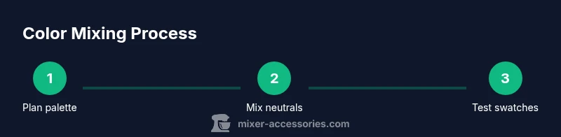
Steps
Estimated time: 60-90 minutes
- 1
Choose a core palette
Select your primary colors (one warm, one cool) plus white and black. Place them in a logical order on the palette so you can reach each quickly. This reduces search time and helps you predict how each color interacts when mixed.
Tip: Label pigments with small notes to recreate mixes later. - 2
Prepare your workspace
Clear your area, lay down a protective surface, and set up a dedicated swatch sheet. Have a clean water source and towels handy. A tidy setup minimizes cross-contamination and keeps your colors true.
Tip: Wipe brushes between color families to avoid muddy transitions. - 3
Create neutrals first
Mix neutrals by combining complementary colors in small increments or adding gray. Neutrals help anchor the color plan and prevent oversaturation in larger areas.
Tip: Keep a neutral reference stripe on your swatch sheet. - 4
Build tints, tones, and shades
Add white to create tints, gray to create tones, and black to create shades. Test each step on swatches to monitor value shifts and avoid muddy results.
Tip: Document the exact ratio you used for each swatch. - 5
Test in lighting
Hold swatches near your painting area and check under the lighting you’ll use for the final piece. Adjust for color temperature if necessary.
Tip: If the swatch looks off, adjust with a touch of its complementary hue. - 6
Label and record mixes
Record pigment names, ratios, and the intended use (highlights, shadows, mid-tones). This makes future reproductions faster and more accurate.
Tip: Create a simple template for consistency. - 7
Refine palettes for sessions
Review which mixes you’ll actually use in your current project and pare down to the essentials. A lean palette reduces decision fatigue.
Tip: Keep one or two experimental colors for improvisation. - 8
Practice a color-matching exercise
Choose a target swatch and try to reproduce it using your palette. Compare and adjust until you’re satisfied with the match.
Tip: Aim for a reproducible process you can apply to any subject.
Your Questions Answered
What is the difference between a tint, a shade, and a tone?
A tint is when white is added to a color, lightening it. A shade is when black is added, darkening it. A tone is created by adding gray, reducing both brightness and saturation. Using these adjustments helps you control value and mood without changing the color identity.
A tint lightens, a shade darkens, and a tone dulls the color by adding gray.
How many colors should I start with?
Start with three primaries (one warm, one cool, one yellow) plus white and black. Add a couple of convenient earth tones or a couple of favorite neutrals as you gain confidence. This keeps options manageable while you learn color relationships.
Begin with three primaries, white, black, and a couple of neutrals to build from.
Why do my colors look muddy when mixed?
Muddy colors usually come from mixing too many pigments together or using dirty brushes. Clean your tools between color families and avoid over-mixing. If a color feels dull, try introducing a small amount of its complementary hue or a touch more white.
Mud comes from too many pigments or dirty brushes; clean frequently and adjust with a tiny amount of the opposite hue.
How can I test color accuracy under different lighting?
Test swatches under the lighting you’ll use for the final piece. If possible, compare under daylight, then under your studio light. Make note of any shifts and adjust your mixes accordingly to preserve color intent.
Test swatches under your actual lighting, adjust for any shifts you notice.
How should I store my color palette for future sessions?
Keep a labeled palette with the core colors and swatches, plus a simple color log for future reference. Store in a clean, dry area away from direct sunlight to prevent color fading or pigment separation.
Label and store your palette in a clean, dry place away from sunlight.
Watch Video
Top Takeaways
- Plan a limited palette before painting.
- Test colors under your painting light.
- Document mixes for consistency.
- Neutral tones anchor color harmony.
- Regular swatch testing improves accuracy.