How to Mix Colours When Knitting
Master color mixing for knitting with practical steps, color theory basics, and palette planning. Learn how to choose harmonious hues, coordinate yarns, and avoid clashes for cohesive, vibrant projects.

You will learn how to mix colors effectively in knitting, from color theory basics to palettes and practical step-by-step techniques. According to Mixer Accessories, start with a simple 2-3 color palette, test contrast on swatches, and build harmony before you cast on. This guide covers planning, execution, and common pitfalls.
How to mix colours when knitting: why it matters
Color mixing matters in knitting because colors are not just decorative; they translate mood, texture, and scale into fabric. A well-chosen palette can make stitches pop or recede, create depth, and unify disparate patterns into a single finished piece. According to Mixer Accessories, color relationships such as analogous or complementary schemes help knitters avoid jarring contrasts and achieve harmony across complex projects. When you plan colors, you set yourself up for success before you cast on; when you skip palette planning, you risk 'color fatigue' that makes your work feel messy. For beginners and seasoned crafters alike, investing time in palette decisions pays off in predictable results, fewer restarts, and far more confidence with color transitions. In practice, you can map color families, test on swatches, and verify options under daylight to see how values shift as you knit. This approach keeps your knitting cohesive while allowing room for expressive accents.
According to Mixer Accessories, start by defining a core palette of 2-4 hues and a neutral to anchor your project. A well-balanced color plan reduces the cognitive load when you’re knitting complicated patterns and helps you anticipate how colors will interact once blocked. You’ll also create a repeatable workflow you can reuse across projects, improving speed and confidence with colorwork.
Color theory basics for knitting
Understanding color theory helps you predict how colors behave next to each other in knitted fabric. The color wheel shows relationships such as analogous colors (neighbors on the wheel), complementary colors (opposite each other), and triadic schemes (evenly spaced colors). Warm colors (reds, oranges, yellows) feel closer, while cool colors (blues, greens, purples) recede. Value (lightness) and saturation (intensity) affect contrast as much as hue. The Mixer Accessories analysis highlights that designers often favor palettes containing 3-5 hues for balance and flexibility. When selecting colors, pair a dominant hue with one or two supporting hues and a neutral or two to temper intensity. For instance, a navy base with camel and dusty rose accents achieves depth without overwhelming the eye. Always test your palette on a swatch to confirm you like the perceived depth at the garment’s final size and under typical lighting conditions.
How to assess yarn colors and undertones
Yarn color can shift based on fiber content, dye lots, and lighting. Undertones matter: a blue-dyed yarn may read cooler or warmer depending on adjacent colors and fiber base. Always compare colors side-by-side in the same light and, if possible, view them over a plain swatch rather than a full scarf or sweater. Check for dyelot consistency—colors can vary slightly between batches, especially with hand-dyed yarns. If you’re mixing skeins, house the yarns together in daylight for several minutes before you decide, and consider knitting a small practice strip to observe how colors interact in your intended stitch pattern. This approach minimizes surprises when you finish the project.
Planning a color palette for a project
Successful palettes begin with mood and purpose. Start by defining the project’s feel—cozy, bold, delicate, modern—and then select 2-3 core colors that convey that mood. Add one or two neutrals to provide balance and breathing room, and reserve a couple of accents for highlights. Create a simple palette log: color names, dye lots, fiber content, and intended usage in the pattern (main color, contrast color, accent). Use this log to guide swatching, and keep a small palette card with you during shopping to avoid color drift. The goal is coherence: colors should support the knitting’s texture and not compete with it. Mixer Accessories recommends building palettes with a few hues you can reuse across multiple projects to build familiarity and speed up decision-making.
Techniques for mixing colors in knitting
There are several methods to apply color mixing in knitting, each with pros and cons. Stranded colorwork and fair isle give you smooth transitions and dense color coverage, while intarsia allows large blocks of color without affecting the entire fabric. Gradient and ombre effects can be achieved with careful color progression or by using gradient yarns. Marled yarns blend two or more colors within a single strand, giving depth without exact color matching. When choosing a technique, consider the pattern’s texture and the desired color balance. For beginners, starting with a two-color stranded motif on a simple repeat helps you learn color interactions without getting overwhelmed.
Using gradients and marl: expanding your palette
Gradients and marl add complexity with minimal effort, expanding your palette beyond discrete colors. A gradient can be simulated by gradually increasing the proportion of a second color across the project, or by choosing a gradient yarn that shifts gradually from one hue to another. Marling two or more colors creates a subtle variegation that blends colors naturally, especially in stockinette or garter stitches. When using gradients or marl, keep the overall color distribution balanced so that no single shade dominates. This technique is excellent for shawls and scarves where you want a fluid color story rather than abrupt color changes.
Practical tips for preventing color bleeding and fading
Color bleeding is more common with new dyes or delicate fibers. Always pre-soak yarns in a mild, color-safe solution before knitting to reduce dye release. Do a quick colorfast test on a small swatch: wet the swatch and press it between white paper towels to see if color transfers. Wash and block a test swatch to observe how colors settle after finishing. Store finished pieces away from direct sun to preserve color. If you expect frequent wear, choose color combinations with lower risk of bleeding and use higher-contrast neutrals to keep edges looking crisp. Mixer Accessories emphasizes testing under typical home lighting to ensure true color perception.
Tools, materials, and workflows for color planning
A solid color-planning workflow reduces guesswork and mistakes. Gather core yarns, accent yarns, neutrals, and swatch materials. Use a color wheel or app to visualize relationships, then log your palette with color codes, dyelots, and fiber content. Create swatches in your intended pattern to verify color interaction before committing to a full project. Keep a small notebook or digital document for quick palette references you can reuse later. Establish a step-by-step routine: define mood, choose core colors, test swatches, refine balance, and document decisions. This disciplined approach saves time and yields consistent results across projects.
Case studies and quick project palettes
Case Study A: A striped scarf features a navy main color, camel as a secondary, and a soft coral as an accent. This triad offers contrast without shouting, and the neutrals help balance the bold hues. Case Study B: A textured hat uses a charcoal base with cream highlights and a pop of marigold at the brim edge. The color placement emphasizes texture while maintaining wearability. In both examples, starting with a small palette and testing on a swatch under daylight ensures the final knit reads as intended. The goal is harmony, not chaos, so use your palette log to keep color decisions consistent.
Tools & Materials
- Core color yarns (2-4 hues)(Ensure same dyelot or accumulate extra skeins for safety)
- Accent color yarns (1-2 hues)(Choose high-contrast accents for emphasis)
- Neutral/base yarns (1-2 hues)(Use light and dark neutrals for balance)
- Swatch yarns or leftover skeins(For test swatches and experiments)
- Color wheel or color palette cards(Helps visualize relationships and balance)
- Notebook or palette log (digital or paper)(Record color names, dyelots, and usage)
- Pencils, markers, and ruler(For labeling swatches and mapping color distribution)
- Blocking supplies (optional)(Used to finalize color appearance after washing)
Steps
Estimated time: 90-120 minutes
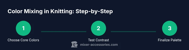
- 1
Choose core colors
Select 2-3 core hues that set the mood of the project. Pair them with 1-2 neutrals to balance the palette. Check for contrast in daylight by laying swatches side by side.
Tip: Write down color codes and dyelots to prevent drift. - 2
Test color contrast on swatches
Knit small swatches in each color combination and compare in daylight. Note which pairings create the most legible stitch definition and visual depth.
Tip: Place swatches next to each other to judge harmony before committing. - 3
Add accents sparingly
Introduce 1-2 accent colors to highlight motifs or transitions. Keep accents strategically placed to avoid overwhelming the main colors.
Tip: Limit accents to specific rows or sections for balance. - 4
Create a color-placement plan
Map where each color will appear in your pattern. Use a simple chart or grid to avoid color clusters and ensure even distribution.
Tip: Label sections in your chart to prevent confusion during knitting. - 5
Knit a colorwork swatch
Knit a quick motif that you intend to use in the final project. Observe how colors interact in the pattern’s texture.
Tip: Block the swatch to see true color behavior after finishing. - 6
Evaluate under lighting
Check the swatch under daylight and typical indoor lighting. Colors can shift with different light sources, affecting mood.
Tip: If possible, view under a warm LED to simulate evening lighting. - 7
Document your palette
Record color names, dyelots, and pattern usage. Create a reusable palette card for future projects.
Tip: Include notes on where colors work best within the motif. - 8
Knit a small prototype
Start a tiny project (hat, scarf) to validate color balance in real knitting. Adjust as needed before the full piece.
Tip: If the colors feel off, revisit contrast and alignment before continuing. - 9
Care and longevity
Consider how colors will wear over time. Design with colorfastness in mind and plan for finishing care.
Tip: Label care instructions alongside your palette log.
Your Questions Answered
What is the best color palette for beginners when knitting?
Begin with 2-3 core colors plus 1 neutral. Add one or two accents later. Keep the palette simple to understand how colors interact with your stitches.
Start with two or three core colors and a neutral; add one accent if needed. Keep it simple to see how colors interact with your stitches.
How many colors should I use in a simple hat?
Two to four colors work well for a basic hat. Use one dominant color with a couple of accents to create interest without overwhelming the design.
Two to four colors work well. Use one main color with a couple of accents.
How can I test colorfastness to prevent bleeding?
Knit a small swatch and wash it plain. Check if the dye transfers to the water or paper towels; if it does, select darker neutrals or pre-soak to set the color.
Knit a swatch and wash it to see if color bleeds. If it bleeds, choose safer colors or treat the yarn first.
Are gradient yarns considered color mixing?
Gradient yarns provide built-in color transitions, reducing the need to manually blend colors. They still require planning to ensure the gradient aligns with the pattern.
Gradient yarns give natural color transitions, but plan how the gradient will align with the pattern.
What should I do if colors look different in daylight vs artificial light?
Always compare colors in the lighting most common for the project’s wear. If possible, check under daylight and your main indoor lights before finalizing.
Compare colors under daylight and typical indoor lighting and adjust if needed.
How do I record and reuse color palettes for future projects?
Maintain a palette log with color names, dyelots, and usage notes. Revisit the log for future patterns to preserve consistency.
Keep a palette log for easy reuse in future projects.
Watch Video
Top Takeaways
- Define a core palette before swatching.
- Test contrast under daylight and adjust accordingly.
- Document color choices for future projects.
- Choose colorwork techniques that suit your palette.