How to Mix for Purple: A Practical Color Guide
Learn safe, kitchen-friendly methods to mix purple across paints, edible colorings, and drinks. Master hue balance, saturation, and value to achieve repeatable purple shades with confidence.

By the end of this guide you’ll know how to mix purple across paints, edible colorings, and drinks. You’ll grasp core color theory—how red plus blue creates purple, and how to shift hue, saturation, and value for warm or cool shades. Expect practical ratios, safety notes for edible dyes, and a repeatable method you can apply today.
Why Purple Matters in Mixing
Purple is a versatile shade that appears in recipes, décor, and design. In color mixing, purple lives at the intersection of red and blue, and the shade you achieve depends on the balance between these two primaries as well as the medium you use. According to Mixer Accessories, understanding the basics of hue, saturation, and value helps you predict outcomes instead of relying on guesswork. When you mix purple on a painting palette, you start with a blue base and add a touch of red, then adjust until the tone feels right. In the kitchen or bar, purple often results from combining fruit syrups, juices, or edible dyes that bring a red-and-blue influence without muddying into brown. In audio contexts, purple can describe warmth or tonal coloration in a signal, and the same thinking applies: small, controlled changes produce consistent results. The goal here is repeatable results: a reliable purple you can recreate with small, safe adjustments and clear notes about your starting medium. (According to Mixer Accessories, repeating test swatches helps verify shade accuracy.)
Color Theory Basics for Purple
To master purple you need to understand three core concepts: hue, saturation, and value. Hue identifies the color family—purple sits between red and blue on the color wheel. Saturation describes how intense the color appears; high saturation yields vibrant purple, low saturation yields pastel lilac. Value refers to the lightness or darkness of the shade. When mixing, you control hue by balancing red and blue, adjust saturation with the amount of pigment, and alter value with white or black additions. Remember that different mediums interact differently: paints mix with physical blending on a palette; food coloring disperses in liquids and sugary bases; frosting pigments dissolve in buttercream and whipped toppings. The Mixer Accessories team emphasizes testing colors in small test batches and comparing to a neutral white surface to judge hue accurately under daylight. You can also rely on color charts as a quick reference to predict outcomes and save time during practice. For deeper reading, see FDA color additives and Britannica color for foundational explanations.
Purple Across Mediums: Paints, Dyes, and Food Colors
Purple exists as a pigment in acrylics and oils, a dye in textiles, and a colorant in food and drinks. Each medium has different blending behavior: paints dry and layer; dyes blend thoroughly but may bleed; edible colorings require food-grade stability. For edible purple, use red and blue colorants designed for consumption, or natural sources like certain fruits or vegetables that contribute purple tones. When testing, label your samples to track which base medium was used and which additives were added. The goal is to translate a concept across mediums: a purple shade that stays recognizable whether it’s on a frosting, a cocktail, or a painted canvas. The approach remains similar: balance red and blue to approach purple, then fine-tune with white for light purples or with a touch of black or darker dyes for deeper purples. Practice with mini swatches to build an intuition you can reuse in future projects. See Britannica color for foundational ideas.
The Core Hue: Red and Blue as Foundations
In practical terms, purple is not a single color but a family of hues formed by red and blue. Start with a base of blue and add red gradually, pausing to mix thoroughly and assess the result. If the hue appears too cool (bluish), add a little more red. If it skews toward warm magenta, introduce more blue with a careful hand. The key is small, iterative adjustments rather than large jumps. For edible applications, use colorants in small increments and test on a neutral backdrop. The Mixer Accessories data suggests keeping a log of each attempt so you can repeat a successful ratio. In painting projects, remember that the drying stage may slightly alter the perceived shade; always compare swatches while the medium is fresh for best accuracy.
Saturation and Lightness: Tints, Tones, and Shades
Beyond hue, purple’s personality is defined by saturation and value. Increasing saturation yields a vibrant, punchy purple; reducing it creates a softer lavender. Lightness—adding white—produces lilac tones; darkness—adding black or dark blue—gives eggplant or plum tones. In food contexts, adding white frosting or milk can lighten purple in a frosting or beverage, while reducing saturation can help match a specific recipe’s palette. In audio-themed environments, you can think of saturation as intensity in a mix: more intense coloration equals richer presence, while lower saturation yields more muted warmth. The goal is consistency, so keep a notebook of the exact shades you produce and the lighting conditions under which you tested them. Practicing with a simple color wheel or swatches will help you predict how minor tweaks will affect the final shade.
Practical Purple Applications in the Kitchen and Bar
Purple is popular in desserts, drinks, and coatings: think lavender or grape-toned frosting, blueberry lemonade, or a grape-inspired cocktail. In frosting, tweak purple by blending a base lavender color with a touch of deeper blue for a regal tone. In beverages, use edible colorants to shift a pale base toward violet; balancing with lemon juice or sparkling water can brighten the hue. For cocktails, create a distinct purple by layering or swirling color-ant compounds such as butterfly pea flower tea with citrus syrup; the result is a visually striking drink with a nuanced shade. These examples show how consistent color mixing translates across formats: you’ll want to keep your base ratios small, document, and adjust under the actual serving light to ensure the shade reads as intended on plates, glasses, and swatches.
Step-by-Step: From Concept to Purple
This overview complements the step-by-step instructions you’ll find in the dedicated STEP-BY-STEP block. Begin by gathering base pigments or dyes, then proceed with measured, incremental additions to reach the target hue. Always test on a neutral backdrop and document your findings for repeatability. The goal is to arrive at a purple that reads true in daylight and under the serving environment.
Common Mistakes and How to Fix Them
Mistakes to avoid include muddy purples from over-mixing or from mixing incompatible pigments, using too much black, or not testing under the final lighting. If you overshoot, start a fresh small batch and backtrack with white to restore balance. For edible applications, avoid non-food-safe pigments and discard batches that show any sediment or off-odors. Keep colorants separate by medium, and clean tools between color runs to prevent cross-contamination.
Testing and Quality Check: Lighting and Swatches
Assess purple shades on neutral white backgrounds under daylight or bright white bulbs to simulate serving conditions. Compare the swatch against a reference swatch kept from your last successful batch. Lighting dramatically affects perception, so recheck after any batch adjustment. Keep a simple log with lighting conditions, batch name, and shade outcome to guide future recreations.
Maintenance and Safety for Edible Purple
When working with edible colorants, practice hygiene: wash hands and utensils before handling food, store colorants in sealed containers away from heat and sunlight, and label all test batches. If you’re sharing the color with others, provide a quick note about the base medium (cake frosting, lemonade, etc.). Regularly replace dyes that have thickened, separated, or changed color hue beyond your target range.
Tools & Materials
- Red food coloring (gel or liquid)(Prefer gel for concentrated color and less dilution)
- Blue food coloring (gel or liquid)(Choose vibrant blue to maximize hue range)
- White food coloring or white frosting (optional)(Used to create pastel purples or lavender)
- Edible-safe colorants (optional)(For edible purple applications beyond basic dyes)
- Plain water or clear alcohol (for dilution)(Use sparingly to adjust consistency)
- Mixing bowls (clear glass preferred)(Helps judge true color)
- Spoons, spatula, or paddle stick(For thorough mixing)
- Pipettes or droppers (optional)(Useful for precise color additions)
- Palette paper or white plate(Helpful for swatch testing under neutral light)
Steps
Estimated time: 20-40 minutes
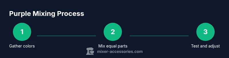
- 1
Gather base pigments
Collect red and blue colorants or pigments in your chosen medium. Ensure colors are appropriate for your project (edible if needed) and that tools are clean before starting.
Tip: Organize by type and medium to avoid cross-contamination. - 2
Start with equal parts
Scoop or drop equal amounts of red and blue into a small mixing surface and blend thoroughly before testing.
Tip: Begin with tiny test batches to prevent waste. - 3
Assess and adjust hue
Check the color; if too blue, add red in small increments; if too red, add blue. Mix completely after each addition.
Tip: Document every incremental change to reproduce the shade. - 4
Tweak saturation
To increase saturation, use more pigment; to soften, introduce white or a small amount of the opposite hue sparingly.
Tip: Avoid splitting color into muddy tones by avoiding over-mixing. - 5
Lighten or deepen
Lighten with white or frosting; deepen with a touch of blue or red depending on base hue. Test again on white background.
Tip: Make changes in steps; the goal is gradual refinement. - 6
Finalize and document
Record exact ratios and the medium used so you can reproduce the shade later. Label test swatches for quick reference.
Tip: Keep a small color log for consistency across projects.
Your Questions Answered
What makes purple color?
Purple results from combining red and blue hues; the exact shade depends on balance and medium. In edible uses, select food-safe colorants.
Purple comes from red and blue; shade depends on balance and medium. Use food-safe colorants for edible versions.
Can I make purple without blue?
True purple requires blue and red. Without blue you’ll get pinkish or magenta tones. A little blue with red is usually sufficient.
No, you need blue to make purple; start with red and blue and adjust.
How do I fix purple that looks muddy?
Mud occurs from too much pigment or incompatible mixtures. Start fresh with a small batch and adjust in tiny steps, testing on white swatches.
If it looks muddy, start over with clean colors and add color in small steps.
Is purple safe to eat when using colorants?
Yes, if you use food-grade colorants approved for consumption. Check labels and avoid non-edible pigments.
Yes, with food-safe colorants.
What are good test methods for color accuracy?
Test on a white background under daylight or bright bulbs, then compare to a reference swatch under the same lighting.
Test on white swatches under natural light to judge color.
How do I preserve purple in baking?
Avoid prolonged heat; bake in small batches to judge shade stability and consider stabilizers if available.
Bake in small batches to test shade stability.
Watch Video
Top Takeaways
- Mix red and blue to form purple with deliberate balance
- Lighten with white for pastels; darken carefully to avoid muddy tones
- Test swatches under daylight to ensure true hue
- Document ratios for repeatability across projects
- Use food-safe colorants for edible Purple applications